
Panorama Software is a world leader in Enterprise BI and AI-Powered Data Analytics for more than 30 years. Our mission is to revolutionize the way people interact with data. Panorama is a known visionary and thought leader in business intelligence (BI) and data analytics. Panorama laid the foundation to the BI industry in the 90’s by developing the OLAP technology, which was acquired by Microsoft and re-branded as SSAS. Panorama then continued to lead the BI industry through innovation, introducing powerful BI tools for enterprises and large organizations.
Through our long and intensive activity in the BI industry, we realized that the potential use of BI across organizations is limited by the way current BI tools operate and are being used for finding information. To address that, Panorama recently introduced new AI-powered data analytics products (aka Augmented Analytics), which bring a paradigm shift in the way people interact with data.
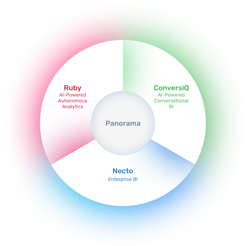
Panorama Necto, our flagship Enterprise BI product, is an enterprise-grade business intelligence (BI) software that helps companies and organizations worldwide to grow revenues, reduce costs and improve corporate performance. Panorama Necto is the preferred business intelligence tool of BI professionals, and it is being used by hundreds of customers worldwide, including some of the world’s largest telecommunications, financial services, retail & wholesale, and healthcare companies.
Panorama Ruby is an AI-Powered Autonomous Analytics solution that continuously collects and analyzes huge amounts of data available within organizations, and uses AI, machine learning and advanced analytics to automatically generate and send personalized key insights with explanations (“Gems”), to relevant users. Such key insights are personalized and prioritized per each user based on Vertical Industry, Department, Role & Responsibility, Level, Interests and Usage.
Panorama ConversiQ is an AI-powered Conversational BI solution that revolutionizes the use of data analytics, and the way people interact with data. It uses natural language processing (NLP), Generative Artificial Intelligence (Gen AI) and Machine Learning (ML) to allow users to ‘talk to their data’ in plain English, eliminating the need for technical expertise. Panorama ConversiQ makes data analysis accessible in real-time, easy-to-use, intuitive, and productive.
for more information
The information will be used for contact purposes and to provide a price quote. The data controller of the database is Top Group Software Ltd. The information will not be shared with third parties except for the purpose for which it was collected, or for the fulfillment of a legal obligation. Data subjects have the right to access their personal information and request its correction, in accordance with Sections 13 and 14 of the Israeli Protection of Privacy Law. Requests regarding these matters and other inquiries may be sent to the company via email: top-privacy@top-group.co.il
We and our partners use information collected through cookies and similar technologies to enhance your browsing experience on our website, analyze how you use it, and for marketing purposes. You can read more about this in our Privacy Policy.